ShopDreamUp AI ArtDreamUp

Deviation Actions


Description
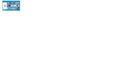
My entry for Art Water Label Contest (digital)
i was thinking a lot about it, there are so many good entries that god! will be very difficult.
I also believe that it is more difficult, not knowing exactly what you are looking for and adapt to nothing is complicated.
*the design don´t have background color
*There are only two objects I want to highlight.
*I carefully picked the colors and objects, related to a meaning.
comment and help me improve
____________
Done in sai
Image size
4797x2700px 1.93 MB
© 2010 - 2024 Styks666
Comments5
Join the community to add your comment. Already a deviant? Log In
Haha~ no worries there!
Oh, because you just cell-shaded the entirety of the piece, it comes off very flat (background) with the water. A little too simple if I saw it as bottle of water in a small convenience store. Due to the fact that blue is so predominant in your composition you need to break the consistency with some shades. Take for example, the Coca-cola can. It has bubbles that are used with a darker red. And you should use the white again for wave like curls up top, putting the transparent in the middle or something like that. The use of white was actually good.
Just some suggestions, shaded water would not overshadow any of the elements of the bottle. Even if it did, you just need to select a contrasting color for the letter form "Art Water" to reestablish the hierarchy on it. The main focus is obviously the brand. The art comes second.
Hope this becomes useful to you!